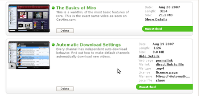
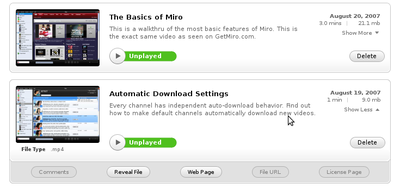
new ui for rendered items
I checked in the latest ui in r8671. I've been told that a number of tweak requests are on their way, but it's looking pretty good and there weren't any major bugs.
The new ui took me a week and a half to implement. There were a bunch of complexities that made it difficult. I thought I'd talk about some of those here so people who aren't as intimate with the code can get an idea of how much work and what kind of work is involved.
First off, Miro 2.0 uses native widgets instead of HTML/CSS/Javascript for everything. The one place this isn't quite true is in the item lists where we're rendering our own widgets using a layout/cellpacking API that abstracts over a platform-dependent implementation layer. The platform-dependent implementation layer consists of two implementations: OSX (cocoa, pyobjc, ...) and GTK (pygtk, pango, ...). The abstraction layer is very similar in style to the GTK side of things. Ben wrote most of this as we needed it a few months ago.
The first problem I had was that I wasn't familiar with the platform-independent layout/cellpacking API we had.
The second is that there are a bunch of variations on the theme. Depending on what the context is, the item gets rendered differently. In playlists, items have a "Remove from playlist" button, but in channels, the item has a "delete" button.
Additionally, items have two display modes: with details and without details. The without details mode is the easiest to render since it's just a bunch of packed things and the resizing handling is easy to deal with. The with details mode is really difficult because we want to show the entire title and description for the item but the cells these bits are in expand as the window is resized. We get into this chicken-and-egg problem where we need to lay things out, but in order to lay things out we need to know the size of the space we're laying things out in, but in order to know the size we need to lay things out....
On top of that, items are either selected or not selected--both of which look different.
The other set of problems I ran into were theming issues. The rendering code tries to "look" like the platform it's running on: the OSX buttons look different than the GTK buttons; OSX uses Finder but Windows uses Explorer and the text needs to reflect that; ...
All of this makes for very complex implementation code. Structuring that as I figured things out was difficult to do well and the result isn't great structure-wise. Ben's already done a pass at fixing the resizing issues which resulted in some structure fixes. It's likely that other things will get fixed and massaged over the next week or so.
The end result of all this work is that we went from this:

Before....
to this:

After....