Input: New feedback form
Since the beginning of 2014, I've been laying the groundwork to rewrite the feedback form that we use on Input.
Today, after a lot of work, we pushed out the new form! Just in time for Firefox 34 release.
This blog post covers the circumstances of the rewrite.
Why?
In 2011, James, Mike and I rewrote Input from the ground up. In order to reduce the amount of time it took to do that rewrite, we copied a lot of the existing forms and styles including the feedback forms. At that time, there were two: one for desktop and one for mobile. In order to avoid a translation round, we kept all the original strings of the two forms. The word "Firefox" was hardcoded in the strings, but that was fine since at the time Input only collected feedback for Firefox.
In 2013, in order to reduce complexity on the site because there's only one developer (me), I merged the desktop and mobile forms into one form. In order to avoid a translation round, I continued to keep the original strings. The wording became awkward and the flow through the form wasn't very smooth. Further, the form wasn't responsive at all, so it worked ok on desktop machines, but mediocre on other viewport sizes.
2014 rolled around and it was clear Input was going to need to branch out into capturing feedback for multiple products---some of which were not Firefox. The form made this difficult.
Related, the smoketest framework I wrote in 2014 struggled with testing the form accurately. I spent some time tweaking it, but a simpler form would make smoketesting a lot easier and less flakey.
Thus over the course of 3 years, we had accumulated the following problems:
The flow through the form felt awkward, instructions weren't clear and information about what data would be public and what data would be private wasn't clear.
Strings had "Firefox" hardcoded and wouldn't support multiple products.
The form wasn't responsive and looked/behaved poorly in a variety of situations.
The form never worked in right-to-left languages and possibly had other accessibility issues.
The architecture didn't let us experiment with the form---tweaking the wording, switching to a more granular gradient of sentiment, capturing other data, etc.
Further, we were seeing many instances of people putting contact information in the description field and there was a significant amount of dropoff.
I had accrued the following theories:
Since the email address is on the third card, users would put their email address in the description field because they didn't know they could leave their contact information later.
Having two cards would reduce the amount of drop-off and unfinished forms than three cards.
Having simpler instruction text would reduce the amount of drop-off.
Anyhow, it was due for an overhaul.
So what's changed?
I've been working on the overhaul for most of 2014, but did the bulk of the work in October and November. It has the following changes:
The new form is shorter and clearer text-wise and design-wise.
It consists of two cards: one for capturing sentiment and one for capturing details about that sentiment.
It clearly delineates data that will be public from data that will be kept private.
It works with LTR and RTL languages (If that's not true, please open a bug.)
It fixes some accessibility issues. (If you find any, please open a bug.)
It uses responsive design, mobile first. Thus it was designed for mobile devices and then scaled to desktop-sized viewports.
It's smaller in kb size and requires fewer HTTP requests.
It's got a better architecture for future development.
It doesn't have "Firefox" hardcoded anymore.
It's simpler so the smoketests work reliably now.

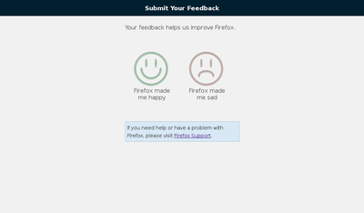
The old Input feedback form.

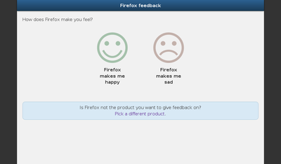
The new Input feedback form.
Going forward
The old and new forms were instrumented in various ways, so we'll be able to analyze differences between the two. Particularly, we'll be able to see if the new form performs worse.
Further, I'll be checking the data to see if my theories hold true especially the one regarding why people put contact data in the description.
There are a few changes in the queue that we want to make over the course of the next 6 months. Now that the new form has landed, we can start working on those.
Even if there are problems with the new form, we're in a much better position to fix them than we were before. Progress has been made!
Take a moment---try out the form and tell us YOUR feedback
Have you ever submitted feedback? Have you ever told Mozilla what you like and don't like about Firefox?
Take a moment and fill out the feedback form and tell us how you feel about Firefox.
Update: 1/18/2021: Input was decommissioned, so this doesn't work anymore.
Thanks, etc
I've been doing web development since 1997 or so. I did a lot of frontend work back then, but I haven't done anything serious frontend-wise in the last 5 years. Thus this was a big project for me.
I had a lot of help: Ricky, Mike and Rehan from the SUMO Engineering team were invaluable reviewing code, helping me fix issues and giving me a huge corpus of examples to learn from; Matt, Gregg, Tyler, Ilana, Robert and Cheng from the User Advocacy team who spent a lot of time smoothing out the rough edges of the new form so it captures the data we need; Schalk who wrote the product picker which I later tweaked; Matej who spent time proof-reading the strings to make sure they were consistent and felt good; the QA team which wrote the code that I copied and absorbed into the current Input smoketests; and the people who translated the user interface strings (and found a bunch of issues) making it possible for people to see this form in their language.