Input: Removing the frontpage chart
I've been working on Input for a while now. One of the things I've actively disliked was the chart on the front page. This blog post talks about why I loathe it and then what's happening this week.
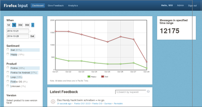
First, here's the front page dashboard as it is today:

Input front page dashboard (October 2014)
When I started, Input gathered feedback solely on the Firefox desktop web browser. It was a one-product feedback gathering site. Because it was gathering feedback for a single product, the front page dashboard was entirely about that single product. All the feedback talked about that product. The happy/sad chart was about that product. Today, Input gathers feedback for a variety of products.
When I started, it was nice to have a general happy/sad chart on the front page because no one really looked at it and the people who did look at it understood why the chart slants so negatively. So the people who did look at it understood the heavy negative bias and could view the chart as such. Today, Input is viewed by a variety of people who have no idea how feedback on Input works or why it's so negatively biased.
When I started, Input didn't expose the data in helpful ways allowing people to build their own charts and dashboards to answer their specific questions. Thus there was a need for a dashboard to expose information from the data Input was gathering. I contend that the front page dashboard did this exceedingly poorly--what does the happy/sad lines actually mean? If it dips, what does that mean? If they spike, what does that mean? There's not enough information in the chart to make any helpful conclusions. Today, Input has an API allowing anyone to fetch data from Input in JSON format and generate their own dashboards of which there are several out there.
When I started, Input received some spam/abuse feedback, but the noise was far outweighed by the signal. Today, we get a ton of spam/abuse feedback. We still have no good way of categorizing spam/abuse as such and removing it from the system. That's something I want to work on more, but haven't had time to address. In the meantime, the front page dashboard chart has a lot of spammy noise in it. Thus the happy/sad lines aren't accurate.
Thus I argue we've far outlived the usefulness of the chart on the front page and it's time for it to go away.
So, what happens now? Bug 1080816 covers removing the front page dashboard chart. It covers some other changes to the front page, but I think I'm going to push those off until later since they're all pretty "up in the air".
If you depend on the front page dashboard chart, toss me an email. Depending on how many people depend on the front page chart and what the precise needs are, maybe we'll look into writing a better one.